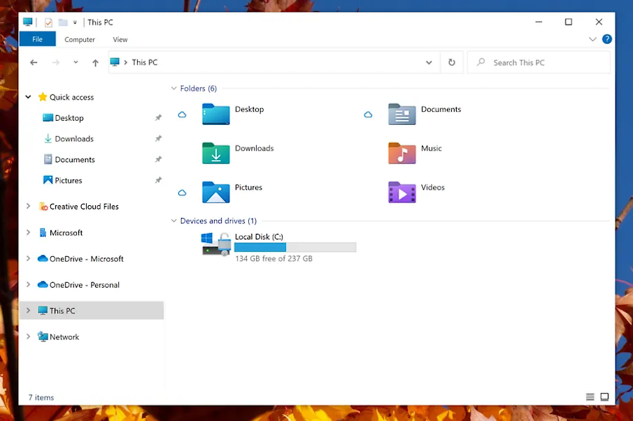
New Windows Icons Are Coming
 OK, so things change, it happens! I don’t know if I like the new look or not, but I am sure it will grow on me.
Windows 10 is getting new File Explorer icons as part of a visual overhaul
The Verge – By: Tom Warren – “Microsoft is giving the File Explorer inside Windows 10 a visual overhaul with new icons. The software giant has started rolling out a test build of Windows 10 that includes changes to the system icons you’ll find in File Explorer, including the Recycle Bin, Documents folders, and devices like disk drives.
‘Several changes, such as the orientation of the folder icons and the default file type icons, have been made for greater consistency across Microsoft products that show files,’ says Amanda Langowski, Microsoft’s Windows Insider chief. ‘Notably, the top-level user folders such as Desktop, Documents, Downloads, and Pictures have a new design that should make it a little easier to tell them apart at a glance.’
Perhaps daringly, Microsoft also notes that ‘and yes, the Recycle Bin icon has also been updated!’ — a clear nod to some changes the company tried to make to the Recycle Bin in the past that didn’t go down well with Windows users.
These icon changes are fairly minor in the grand scheme of Windows, but they’re part of a broader effort inside Microsoft to modernize Windows. Microsoft unveiled new system icons for Windows 10 earlier this month, and the company previously updated some of its Windows 10 icons last year with colorful versions and also tweaked the Start menu to make it more streamlined.
Microsoft is also planning a ‘sweeping visual rejuvenation of Windows,’ codenamed ‘Sun Valley.’ The company is expected to detail its visual plans and more about the future of Windows in the coming months as part of a dedicated news event.
The icon updates will arrive alongside some tweaks to the layout of File Explorer, too. Microsoft is adding additional padding between elements in File Explorer, and there will be a compact mode to return to the classic File Explorer mode. The updated view is a little more touch-optimized and complements the new icons.”